TYPE DEVELOPMENT
I have been interested in type development since early in my undergrad studies under Marcus Melton, who introduced me to Fontographer in the late 90s. I made a few clunky fonts back then, both of which have been lost to digital history. If I recall correctly, one was an attempt at a Russian Constructivist typeface, and the other was a grungy, splattery face created with a set of alphabet sponges dipped in India ink.
I loved the idea that with relatively simple technology, I could create my own typefaces. But, over time my attention was diverted to drawing and painting and printmaking and screenprinting, so type development took a bit of a backseat. However, I’ve now discovered a new type development app called Glyphs, and I’m blown away by it’s ease of use. It may not have all of the features of Fontographer (at least not Glyphs Mini, which I’m using), but it’s also not as clunky or expensive as Fontographer.
At any rate, regardless of the technology, I love drawing letters, and systems of letters. I’m posting these examples here for you to look at, but also to download and use as you will. I only ask that you let me know how you are using them, and send me an image or link where I can see it at work.
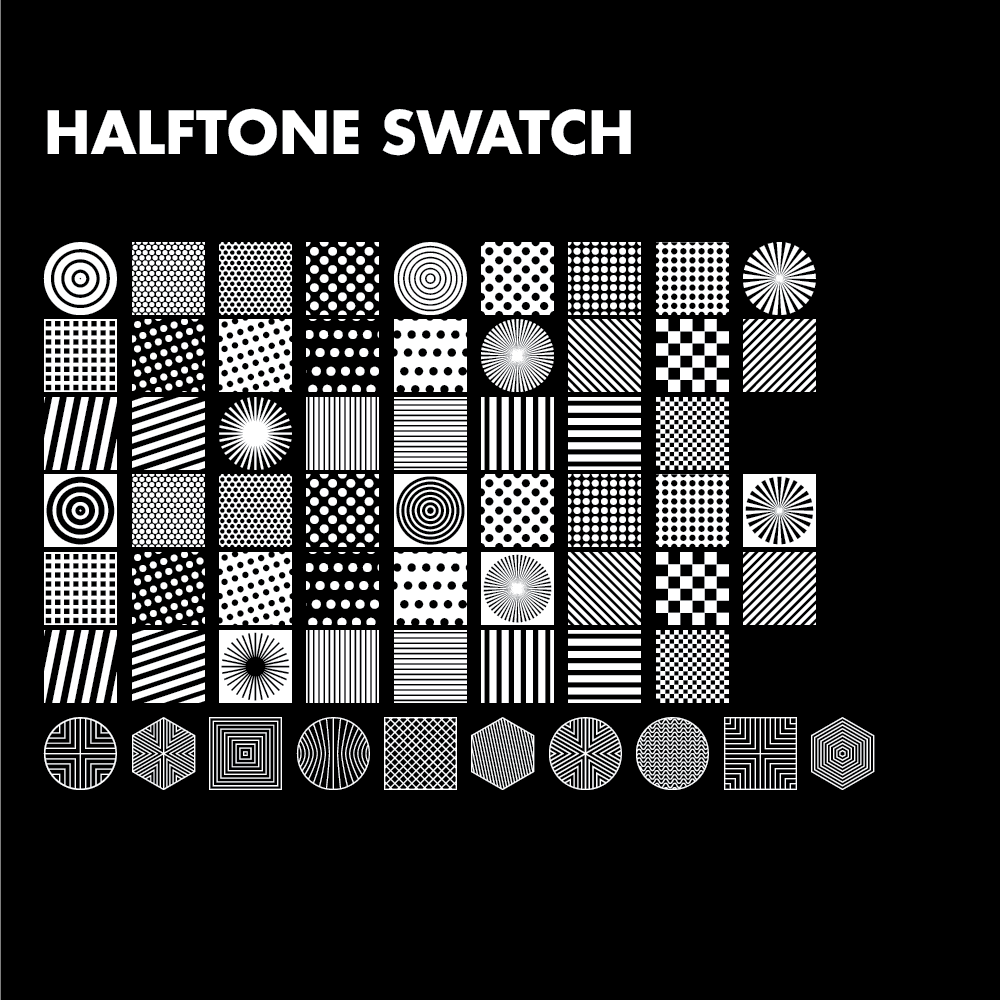
Halftone Swatch
This typeface is a collection of repeatable halftone patterns. I’ve used patterns of this sort for years, and only recently realized I could utilize them as a typeable font.
Archt
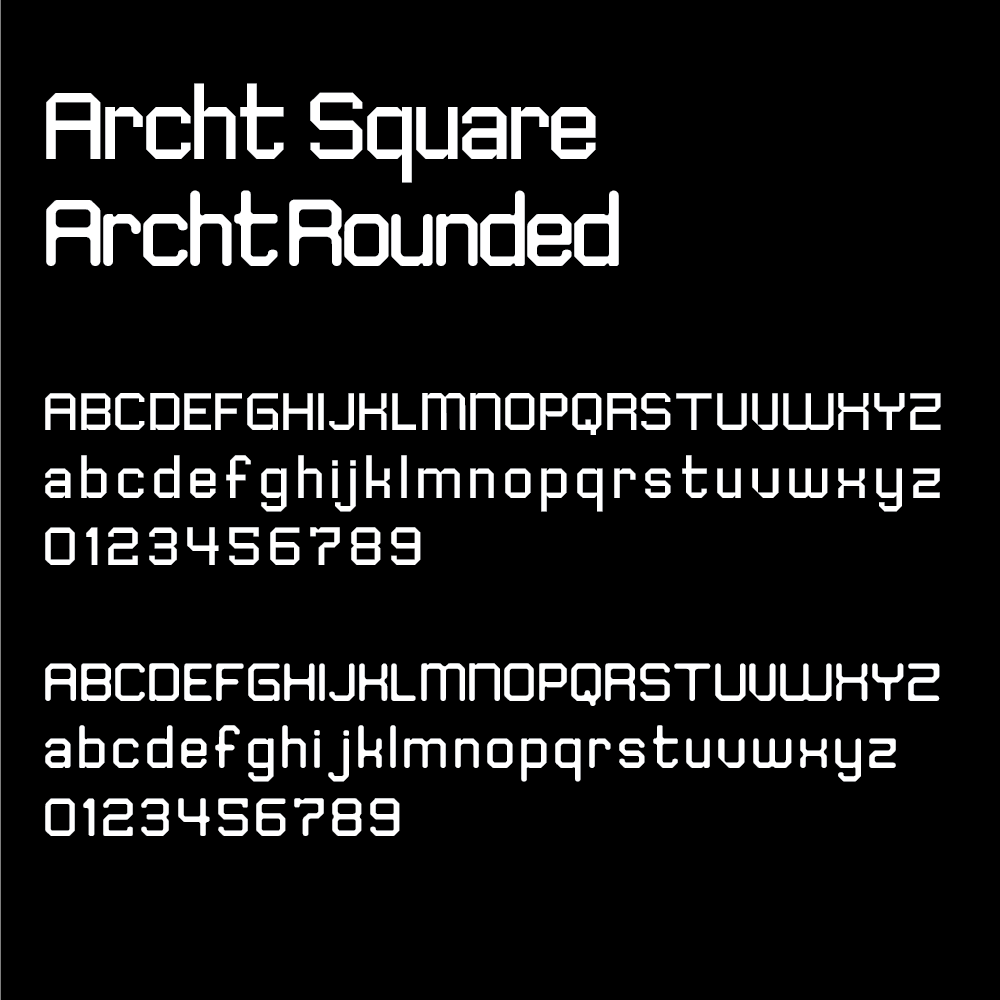
This typeface was inspired by Wim Crouwel’s beautiful octagonal Architype.
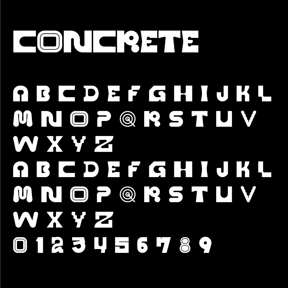
Concrete
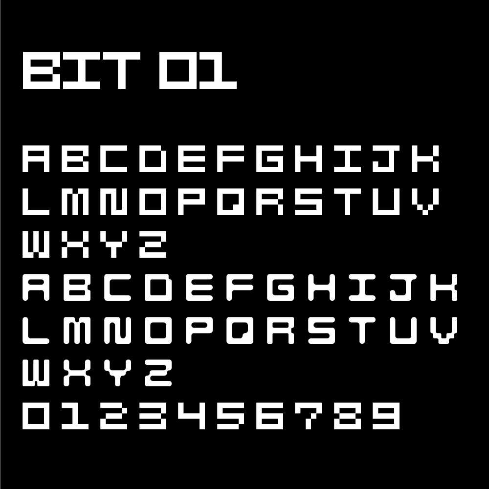
I wanted to create a new-wavish typeface that utilized a chaotic diversity across the character set.
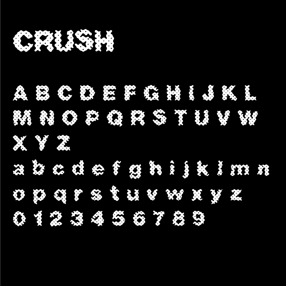
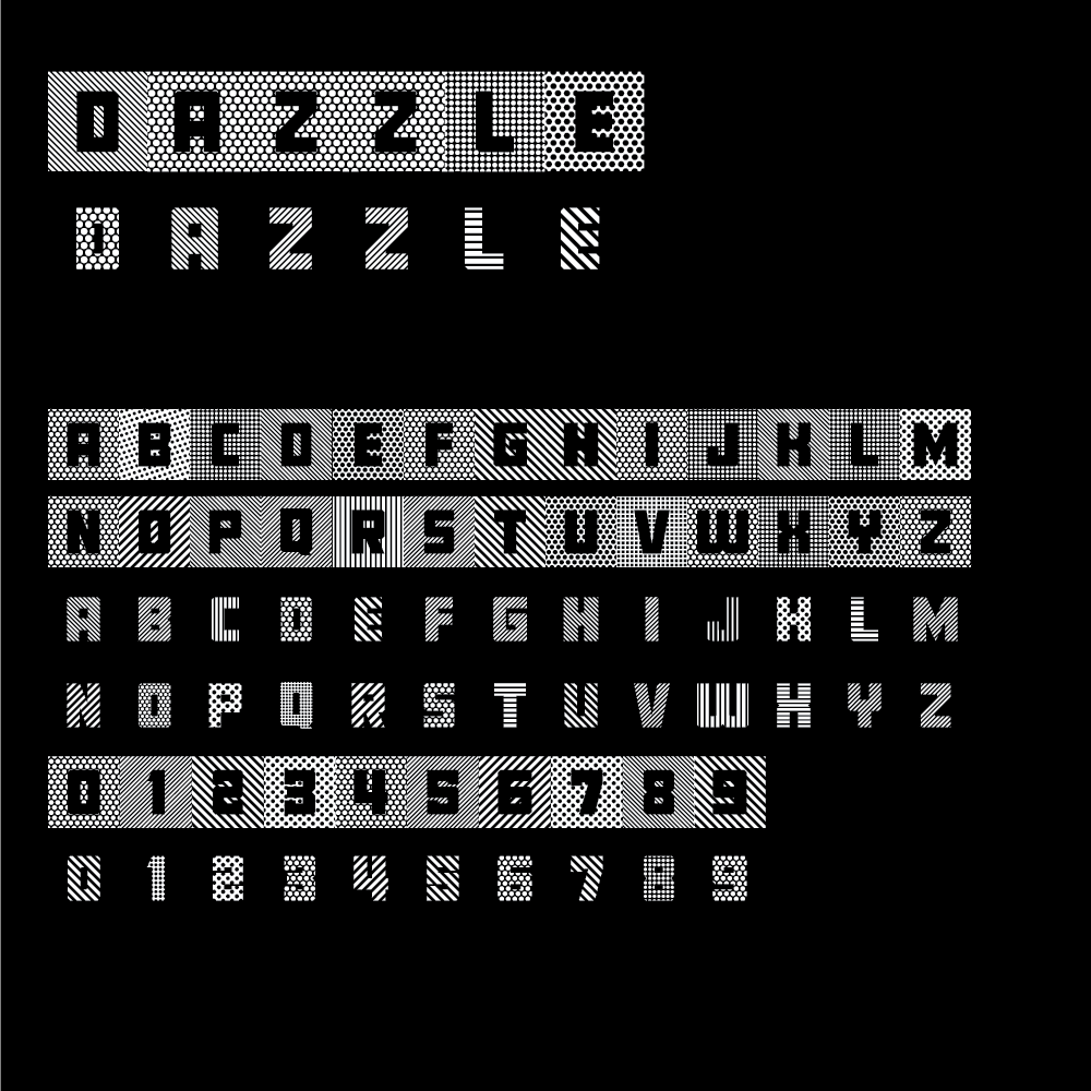
Dazzle
This typeface was extrapolated from Halftone Swatch combined with Fort, so I would type with insane pattens.
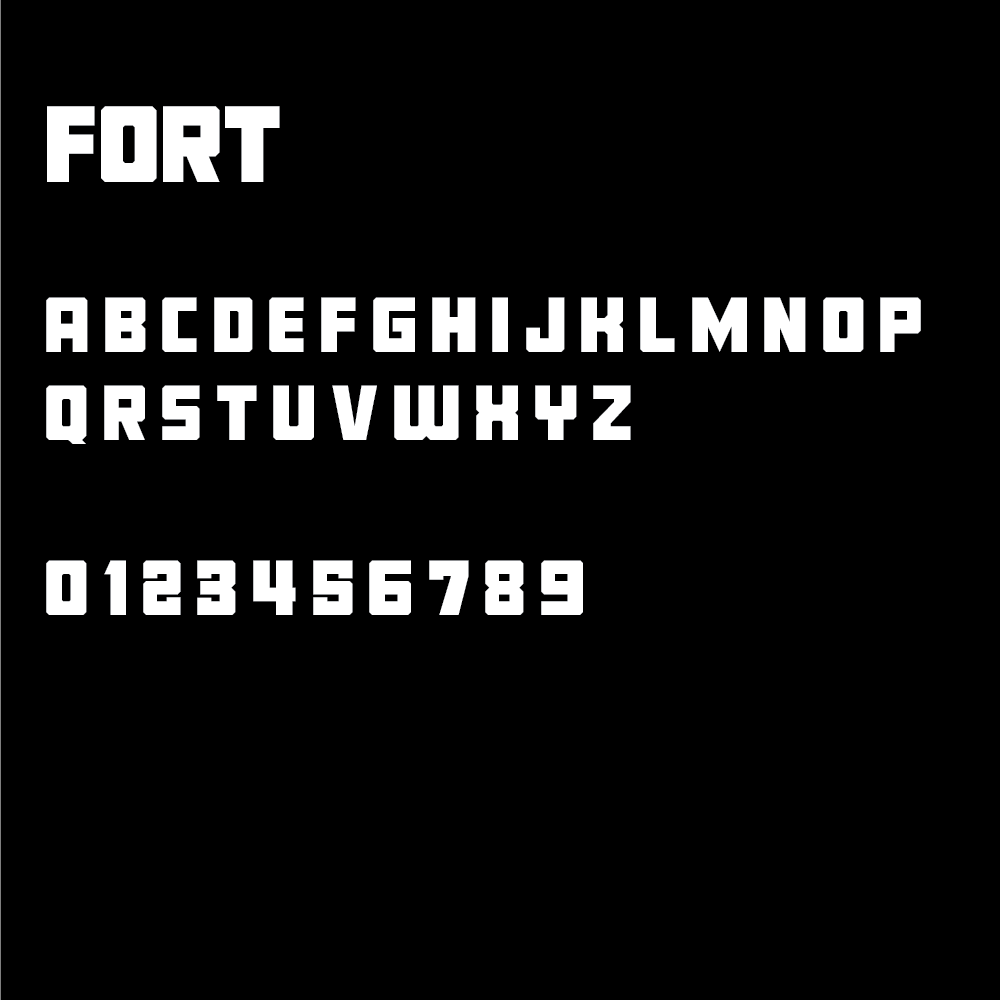
Fort
Fort was designed as a derivative of an industrial sans serif I created a million years ago. It serves as a foundation for some of the other faces that require that very simple appearance.
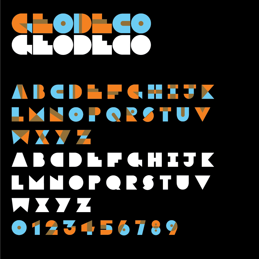
Geodeco
This is my version of an art deco face. I also wanted to experiment with color typefaces in FontSelf, and this overprint-inspired color fit the bill.
Strobe
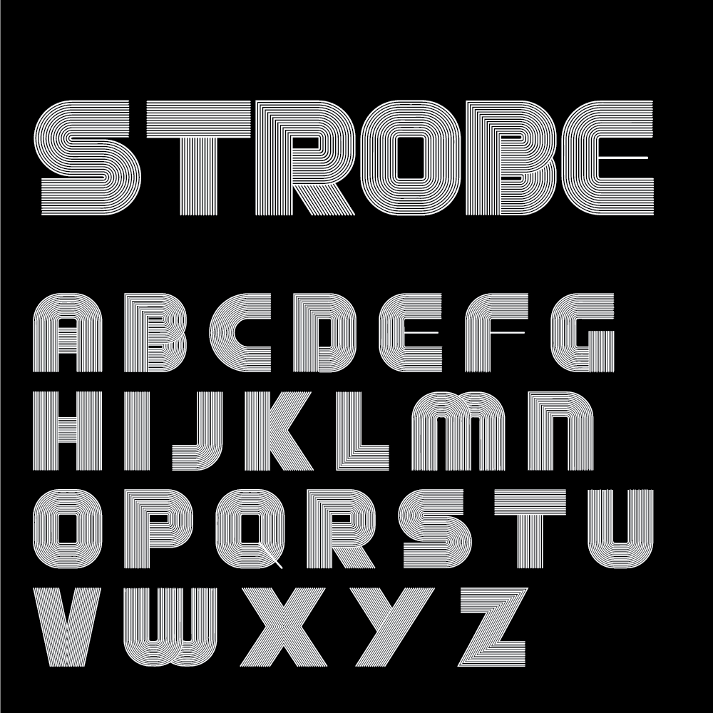
There’s something addictive about developing this sort of lettering. It’s like a puzzle I can’t stop trying to solve.
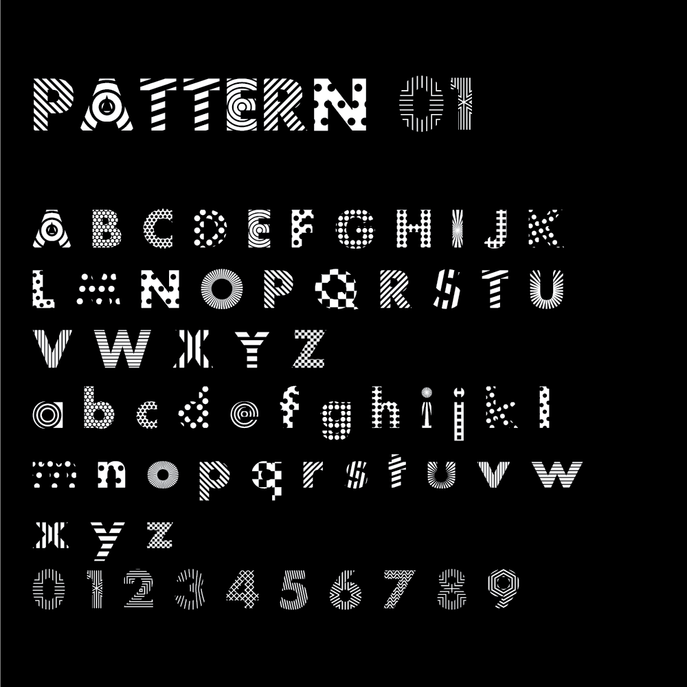
Pattern
This is another collection of pattern samples, but masked into Futura Bold.
