The content of that post.
Author Archives: dennyschmickle
Hand-printed wallpaper
I’ve been screen-printing rolls of custom wallpaper lately for a show in January. It’s been crazy to re-learn details of printing, particularly registration.
Here are some process photos from my tiny studio.
[nggallery id=27]
Harmony and variety in pattern design
I’ve been thinking about this very thing for a while now. Typically, I don’t like grid patterns with a square foundation that don’t interact in some way from one cell to another. There should be some kind of angles or overlap from one cell to the next. Even better is when you can’t easily spot the borders from one cell to the next.
Owen Jones had it figured out 100 years ago.
“In surface decoration, any arrangement of forms, as at A, consisting of only straight lines, is monotonous, and affords but imperfect pleasure; but introduce lines which tend to carry the eye toward the angles, as at B, and you have at once an increased pleasure. Then add lines giving a circular tendency, as at C, and you have now complete harmony. In this case the square is the leading form or tonic; the angular and curved are subordinate.
We may produce the same result in adopting an angular composition, as at D: add the lines as at E, and we at once correct the tendency to follow only the angular direction of the inclined lines; but unite these by circles, as at F, and we have still more perfect harmony, i.e. repose, for the eye has now no longer any want that could be supplied.”
– Owen Jones, The Grammar of Ornament–1910
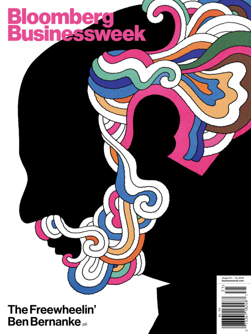
This is how appropriation/satire is supposed to work,…

This is how appropriation/satire is supposed to work, kids.
The Freewheelin’ Ben Bernanke
Illustration by David Parkins. (With apologies to Milton Glaser)
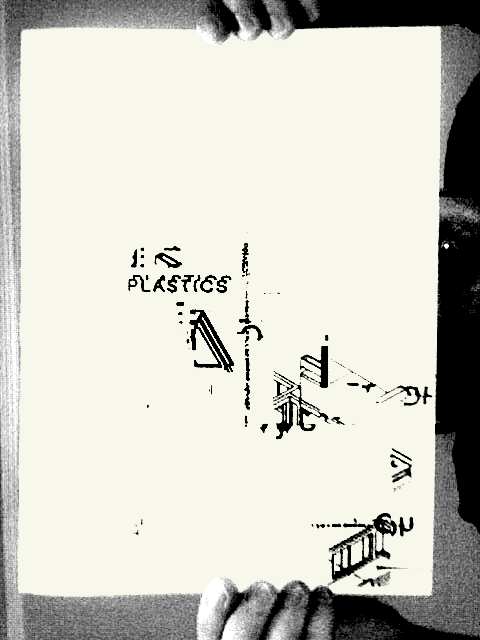
I got my copy of PLASTICS today from Damien and Ronny at Plastic…

I got my copy of PLASTICS today from Damien and Ronny at Plastic Books! Go check it out!
on tumblr: http://dennyschmickle.tumblr.com/post/28369030487
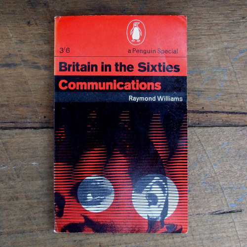
Great collection of Penguin covers amassed by acejet170.

Great collection of Penguin covers amassed by acejet170.
on tumblr: http://dennyschmickle.tumblr.com/post/28201207422
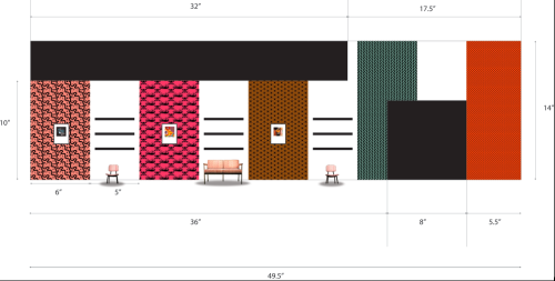
Here’s a rough mock-up of an exhibition I’m working…

Here’s a rough mock-up of an exhibition I’m working on with hand-printed wallpaper, upholstery, and other stuff. The patterns/colors in this mock-up are definitely not going to be used in the actual exhibition. This is just something to look at for now.
on tumblr: http://dennyschmickle.tumblr.com/post/27647141935
Designer as Omnivore
Of course Paul Rand summarized my design philosophy in three sentences (in his book, A Designer’s Words).
“The artist is by necessity a collector; he accumulates things with the same ardor and curiosity [with which] a boy stuffs his pockets. He borrows from the sea and from the scrap heap; he takes snapshots, makes mental notes, and records impressions on tablecloths and newspapers—why one particular thing and not another, he may not know at the time, but he is omnivorous. He has a taste for children’s wall scrawling as appreciative as that for prehistoric cave painting.”—Paul Rand, 1955, via Steven Heller
PUT A (LARRY) BIRD ON IT!
Victims of the Image
Steven Heller has created a powerful and compelling presentation on racism in advertising and design called Victims of the Image: Ethnic and Racial Stereotyping in American Popular Art. I regularly show it to my History of Graphic Design classes, and I feel it is something any American consumer should see. We are very used to some of these images (Aunt Jemima, Uncle Ben, Cleveland Indians, etc) that it behooves us as members of a visual and consumer culture to call out racism where as it is. I am eternally grateful to Mr. Heller for compiling this profoundly uncomfortable, but absolutely necessary, presentation.
——————————————————————————————————-
Here are the other videos in the series:
SVA MFA Designer as Author: Paul Rand Lecture Series


