TEACHING
When I started my teaching assistantship at the University of Nebraska, I realized how much I value working with students in art and design. During graduate school, I assisted a course on Color Theory, and taught my own sections of Typography and Graphic Design.
I have since developed and taught many courses on-ground and online including: Graphic Design I, II, and III, Graphic Design Practicum, Typography I and II, Package Design, Animation, Web Design, History of Graphic Design, Art Marketing, Printmaking I and II, Art Appreciation, Art History, Imaging & Illustration, Infographics, Branding, and a Summer Semester in Italy doing Printmaking and Art History.
My approach to teaching art and design is one of learning-by-doing. And my role in the process is that of a conduit, a facilitator, to connect students to the tools, history, and inspiration they need in order to make their best work.
I believe in process, experimentation, and intuition. I have spent years experimenting with image-making processes, creating gallery installations, and defining and discovering where I fit in to the world of art and design. I draw on that experience when I teach, pushing student-designers to think bigger and better, and to find their own voice.
Students often enter the university wanting to know how to make art. They want to know the techniques for making the kinds of images they like. As a result, they often spend the first half or so of their university experience learning those techniques, and getting familiar with their tools. But there should come a point where they no longer wonder how, but why they want to be an artist or designer. I encourage students to find their point-of-view, and to understand the ethical responsibility and the cultural influence that a graphic designer has. I also want students to build and nurture a sense of empathy. A good designer must be able to understand someone else’s wants and needs. And I want students to know that good design doesn’t just look good, and make things work well, but it also does no harm. Good design is never meant to objectify or stigmatize people. Good designers understand this, and they consider their responsibility to people and the planet.
The projects that I assign are sometimes a bit vague, because I want students to fill in the gaps with their own experience and ideas. This also mimics the process of working with clients who may not know what they want (or don’t want) until they see it. Good design isn’t a recipe, and students need to develop a creative process that will lead them to success. No one is creative all the time. I challenge my students to develop processes that lead to new ideas and points-of-view.
I also believe that it’s vital for a design educator to maintain an active creative practice. And I bring my studio practice to the classroom whenever possible. Whether I’m working with a freelance client, or creating an installation for a gallery exhibition, I bring that context to my students, so they can make those connections from theory to practice.
Classes Include:
(Hover for descriptions.)
Art Appreciation
Art History
Art Marketing
Graphic Design History
Graphic Design I
Graphic Design II
Graphic Design III
Graphic Design Practicum
Imaging & Illustration
Infographics
Package Design
Printmaking I
Printmaking II
Public & Social Service Design
Senior Capstone
Summer Study Abroad in Italy
Symbols
Typography I
Typography II
Type & Image
Visual Branding
Intro to Web Design
Student Work
Augmented Record Covers
Students designed and assembled LP packaging, and made an animated AR experience using EyeJack. 👁
Students (in order of appearance): Kristin Kirnbauer / Imagine Dragons, Samuel Janizor / Wizkid, Lloyd Bussell / Super Smash Bros Soundtrack, Khongorzul Gankhuu / Tash Sultana, Samantha Lombardo / Phil Collins, Austin Muich / Rise Against, Audrey Lard / Vampire Weekend, Sam Hutnyk / Lady Gaga, Ryan Schreiber / Matchbox 20, Shannon Ford / Frank Zappa (interior gatefold), Amy Stadler / Kerli (interior gatefold), Marcela Tobar / Kesha (interior folded poster).
View this post on Instagram
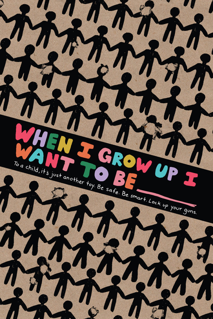
Whenever possible, I encourage my student to think of design as a tool for change in their community. We do plenty of projects with commercial application, but I believe that it is fundamental to consider design as more than that. The following posters were designed around the theme of addressing hate and violence in youth culture.

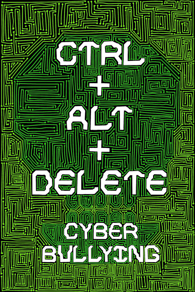
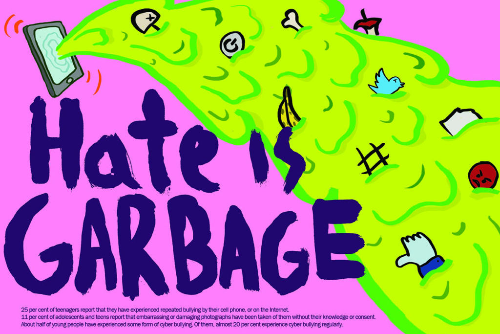
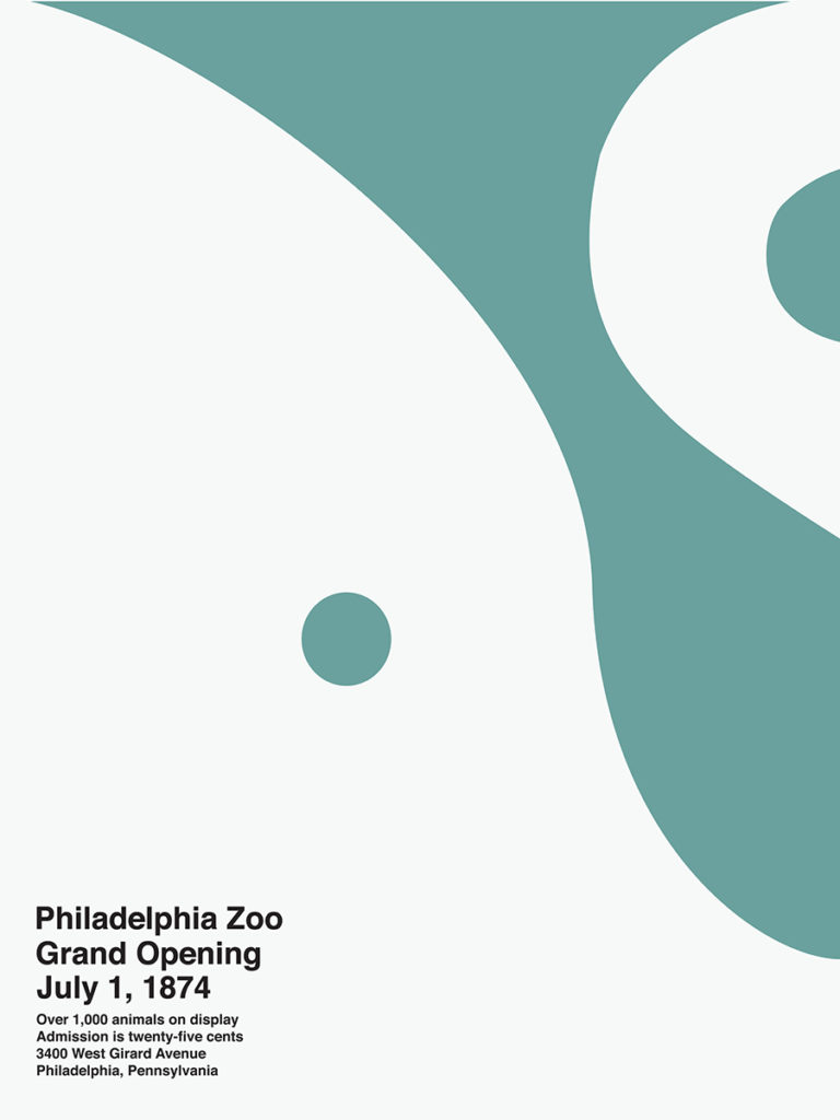
Another project focused on community involvement was A Logo For Everyone. This project, assigned to 3rd-year students, exercised the branding and logo design skills they’ve developed throughout the program. The logo was meant to serve as a new symbol for all people, something wholistic and unifying, not unlike Gerald Holtom’s peace symbol.




Another example of how design intersects with mass culture is the design of sports mascots. Of particular note are the racially/culturally offensive logos of a few NFL, MLB, and NHL teams. In an effort to connect student designers to their everyday life, I commissioned them to design alternative mascots for the Washington Redskins or Cleveland Indians. Their concepts were interesting, innovative, and some could be legitimate alternatives. We discussed alternatives to mascots based on people-groups, and how masculinity and aggression could be reinterpreted through other, less-obvious channels.




It’s important for students to have experience working with “real” clients. And until they perform an internship, they often don’t have a chance to develop those speaking and writing skills that are so essential to building good client relationships. Therefore, when possible, I partner classes with non-profit organizations in need of good design (which is most of them).
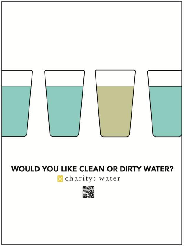
In these particular cases, I reached out to charity:water – an organization based in New York with the mission of providing access to clean water around the world – for whom my students designed a campaign for campus involvement, invitations for Habitat For Humanity, and an identity for a non-profit coffeehouse based out of Copenhagen, Denmark which partners with communities in need in Africa.
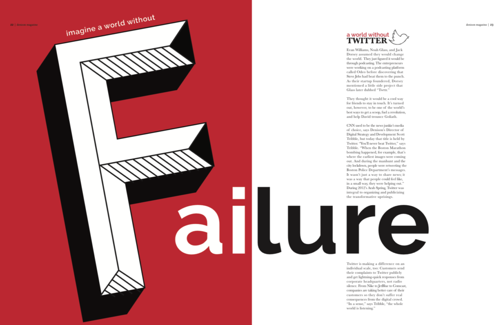
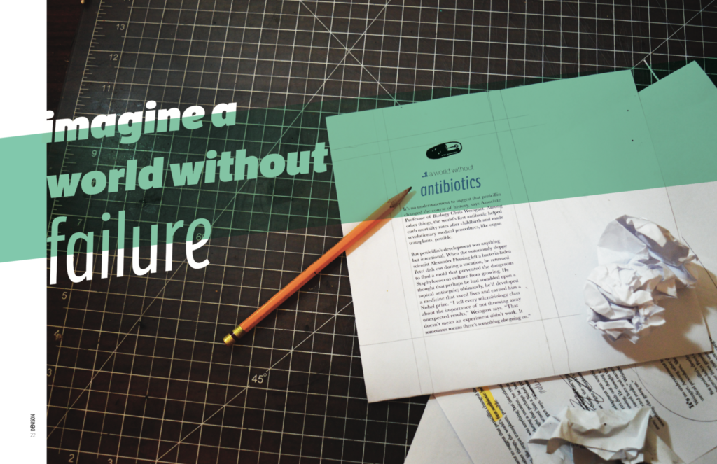
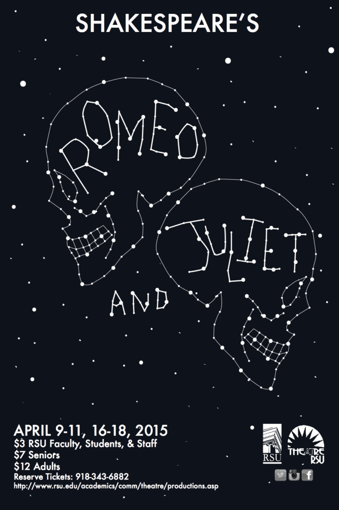
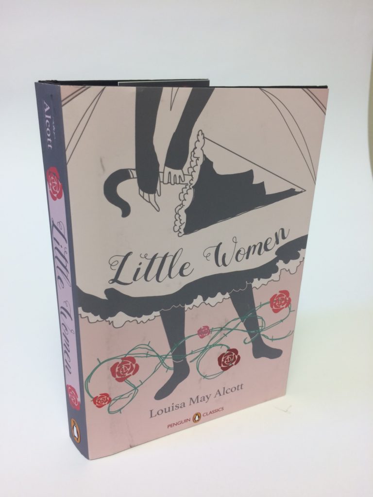
I have always loved designing posters, magazine spreads, and book jackets. These projects represent an editorial layout based on an article about the fear of failure, and how failure can lead to unexpected success, then there are re-imagined book covers for literary classics, and a collection of other posters and miscellaneous design projects.
In Symbols, students develop logos and preliminary identity systems for new and existing companies. Traditionally, developing a crisp, high-contrast, vector-based logo was the end of the line. But as media evolves, a logo has to live and move. So these students went a step further and added motion to their identities.
& Identity Design
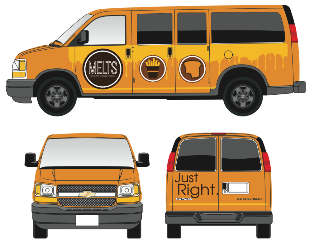
This batch of projects includes package design, illustrated commemorative stamps, posters, and identity work. Package design is always a fun class, as students get to see what is typically 2-dimensional work raise from the page into 3D objects. The stamps are an extreme exercise in scale. How much detail can work on a 1.25″ square?
& Study Abroad
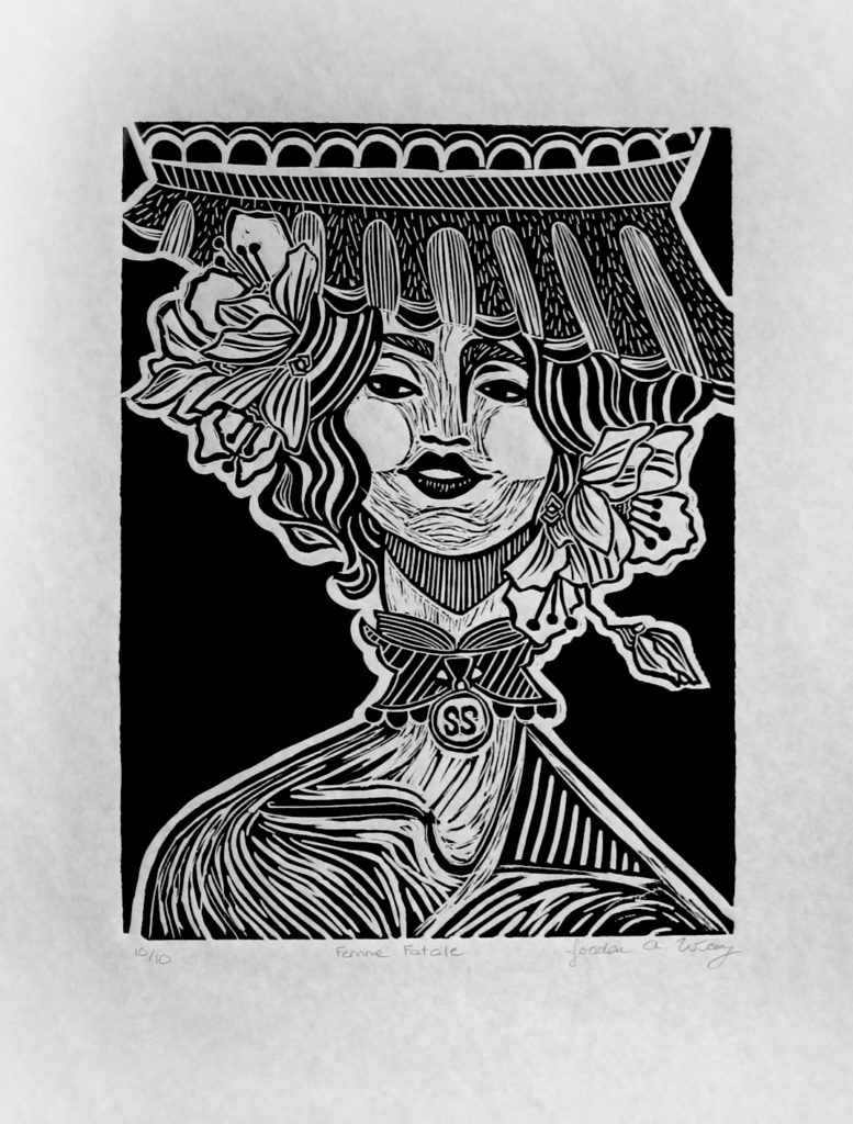
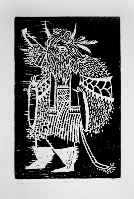
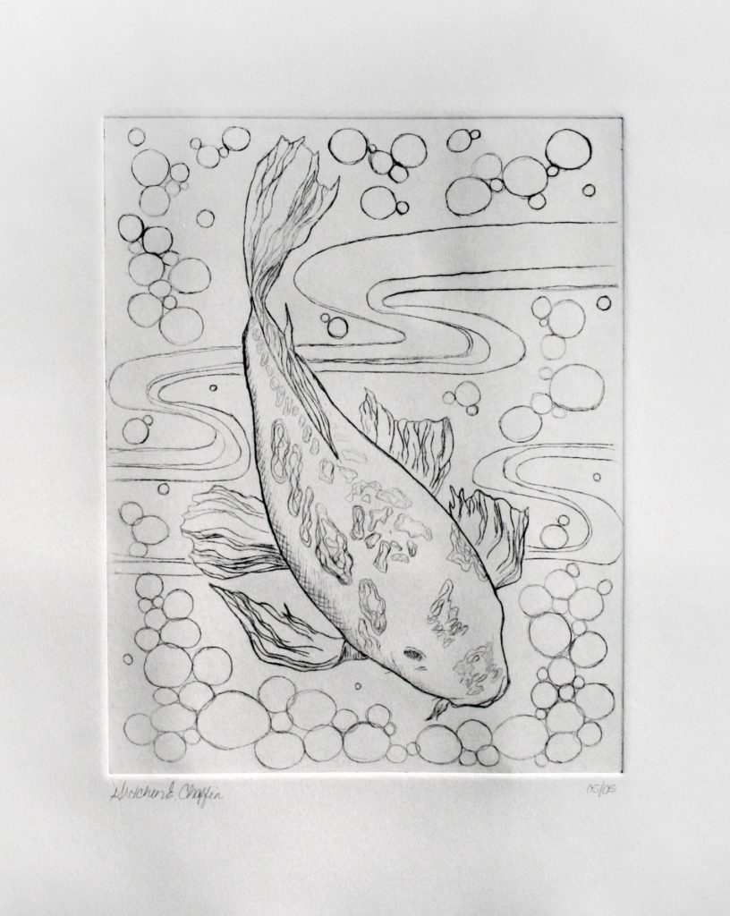
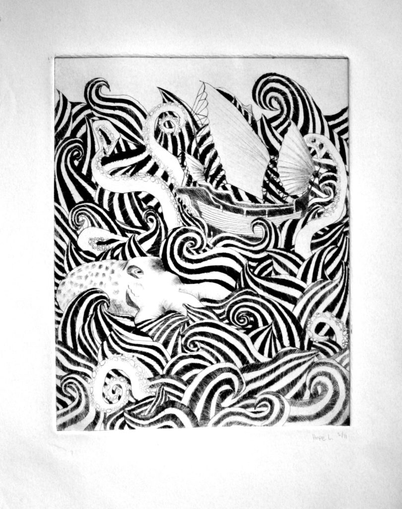
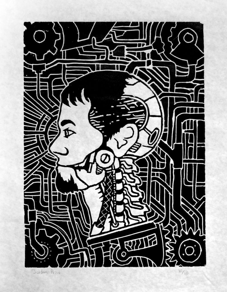
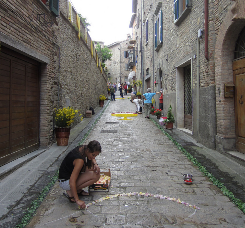
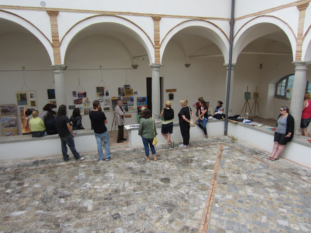
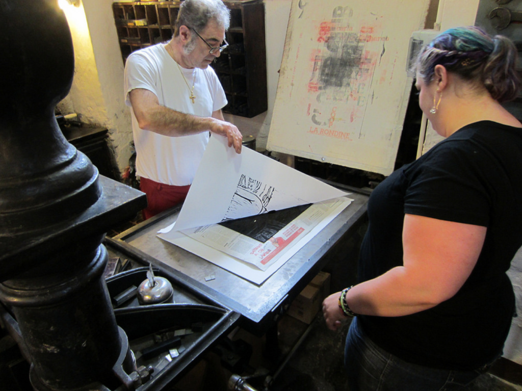
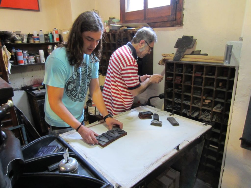
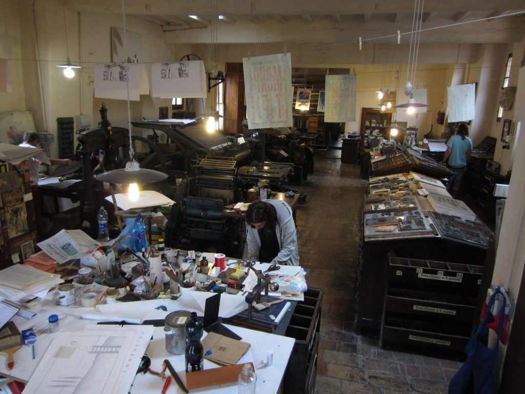
The relationship between graphic design and printmaking is very distinct. Printmaking and various print processes are always present in my own work, and I try to share that passion for print, and the thrill of ink on paper.Travel is also essential. At Rogers State University, I coordinated summer sessions in Montone, Italy where students studied drawing, painting, printmaking, and art history. Each day we would spend the morning drawing and painting, the afternoons making prints, and occasionally traveling to Florence, Venice, Rome, and other regional attractions.
